Intentions
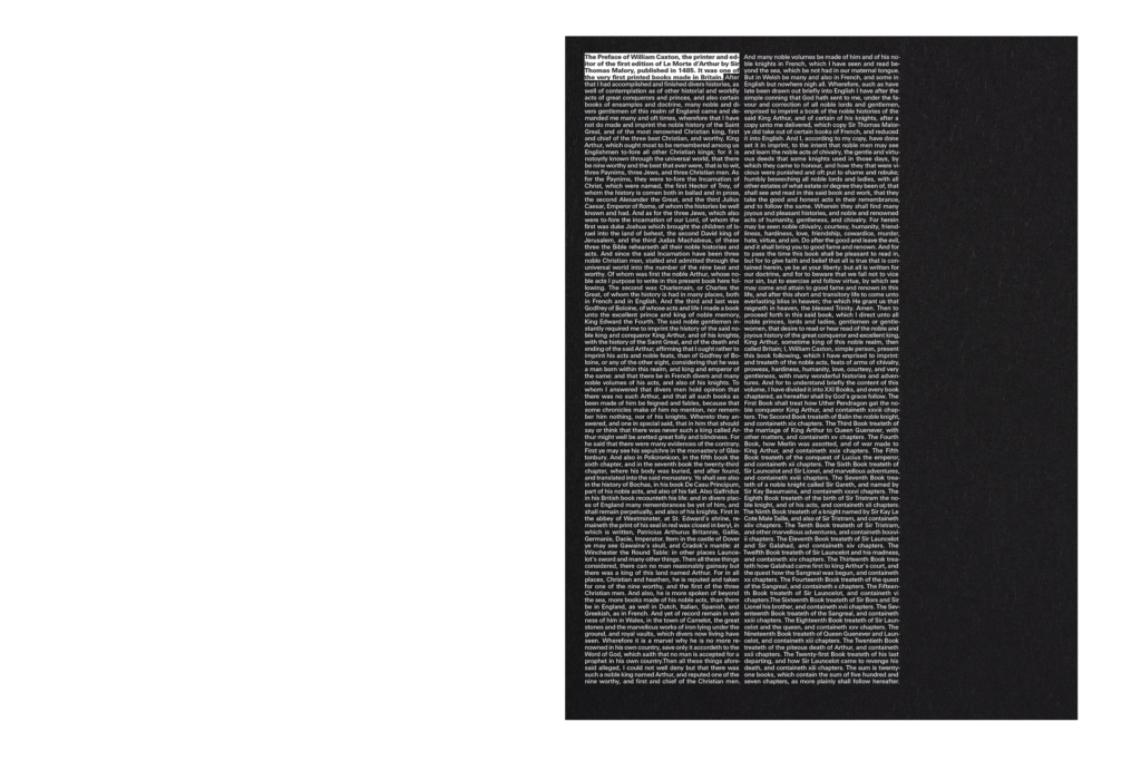
William Caxton is a legend of English graphic design – the first person to bring a printing press to England, and the first person to print a book there. In 1485 he published Le Morte d’Arthur, a chivalric romance detailing the life of King Arthur. The typesetting is remarkable for its clarity and refinement, and can be viewed here. Many appealing subsequent versions have been published, but often they focus on illustrations over typography. The intention was to make a new sculptural and typographic version of the text, using a similarly limited typographic palette to Caxton’s, but in a contemporary way.
Execution
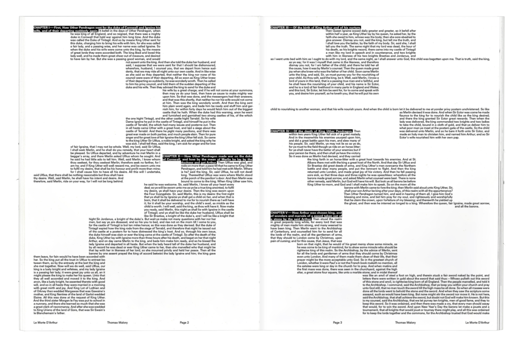
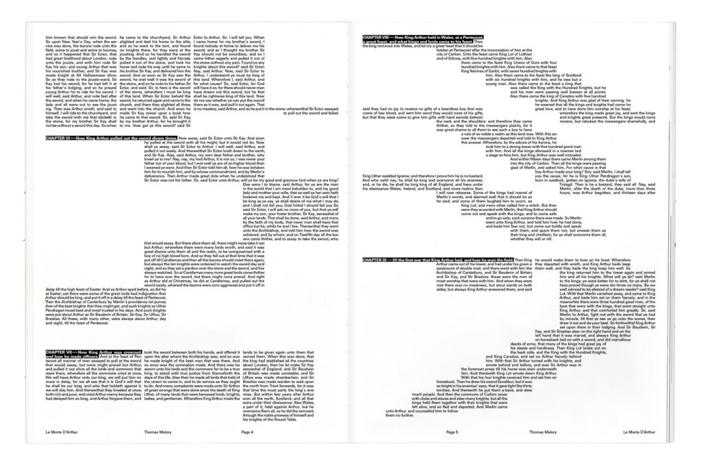
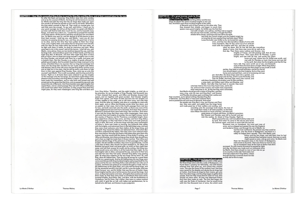
Two fonts in one size were used throughout the entire publication; Univers Regular and Heavy. The text block constantly shifted within the grid, creating visual interest for each text page without relying on illustrations or decoration. Chapter headers were highlighted and inverted to create a strong typographic hierarchy that helped to structure each chapter on the page, and functioned as a nod to traditional drop caps. Caxton’s achievement was supposed to be highlighted as much as that of the author Thomas Malory, so Caxton’s preface to the edition was used as its cover, carefully fitting into two columns of text.