Intentions
Toothpaste is everpresent as part of most people’s daily routine, and the opportunity exists to create a brand which people want to keep visible in their bathroom, rather than hidden in a cupboard.
Execution
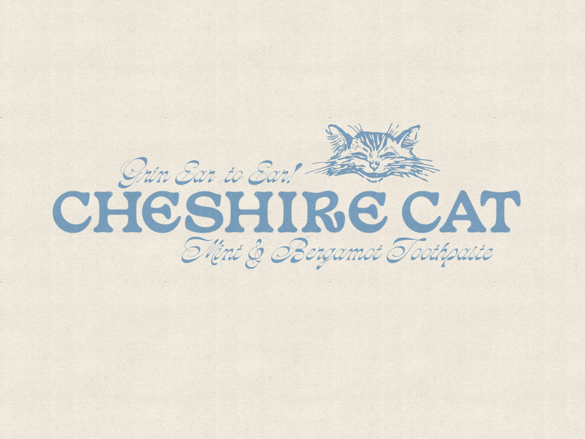
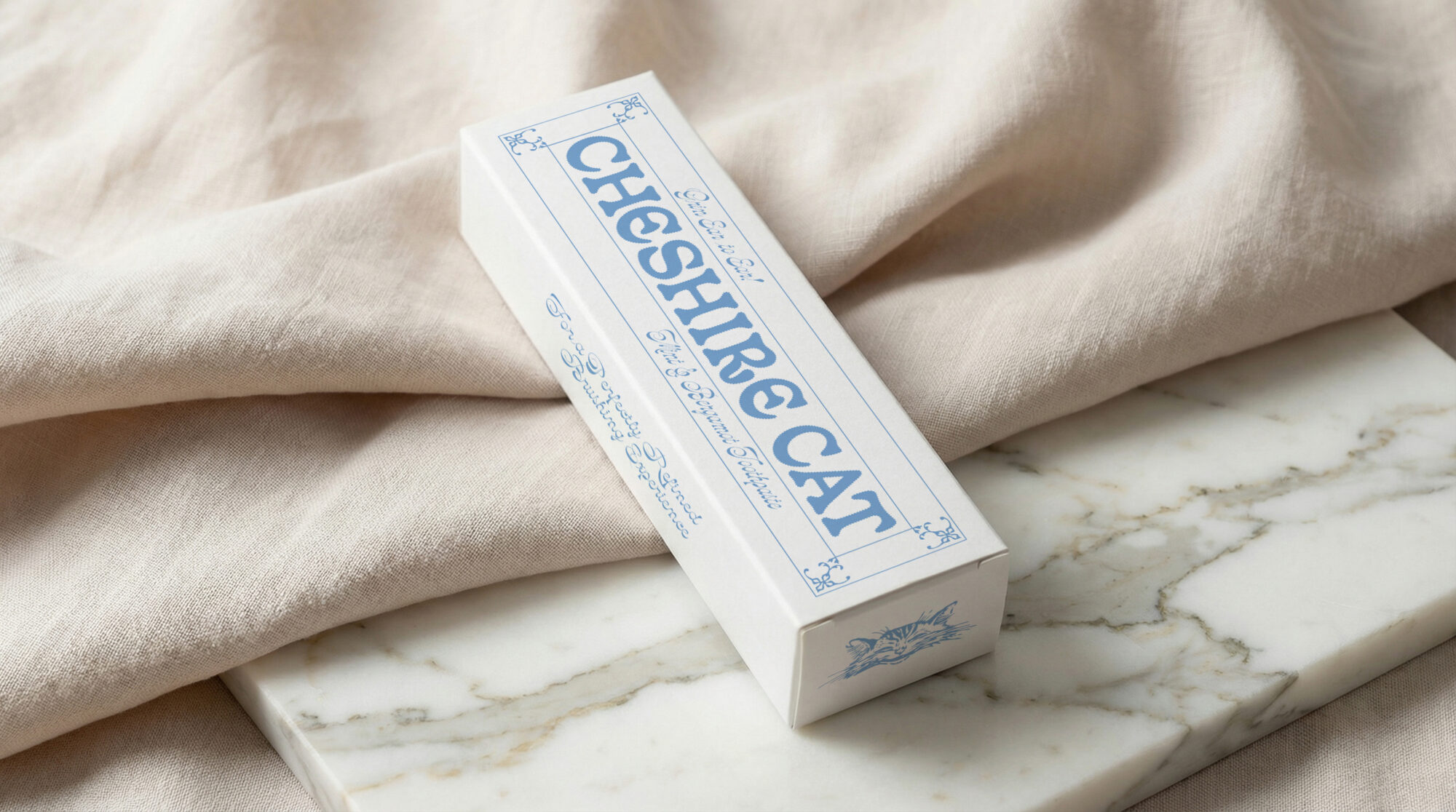
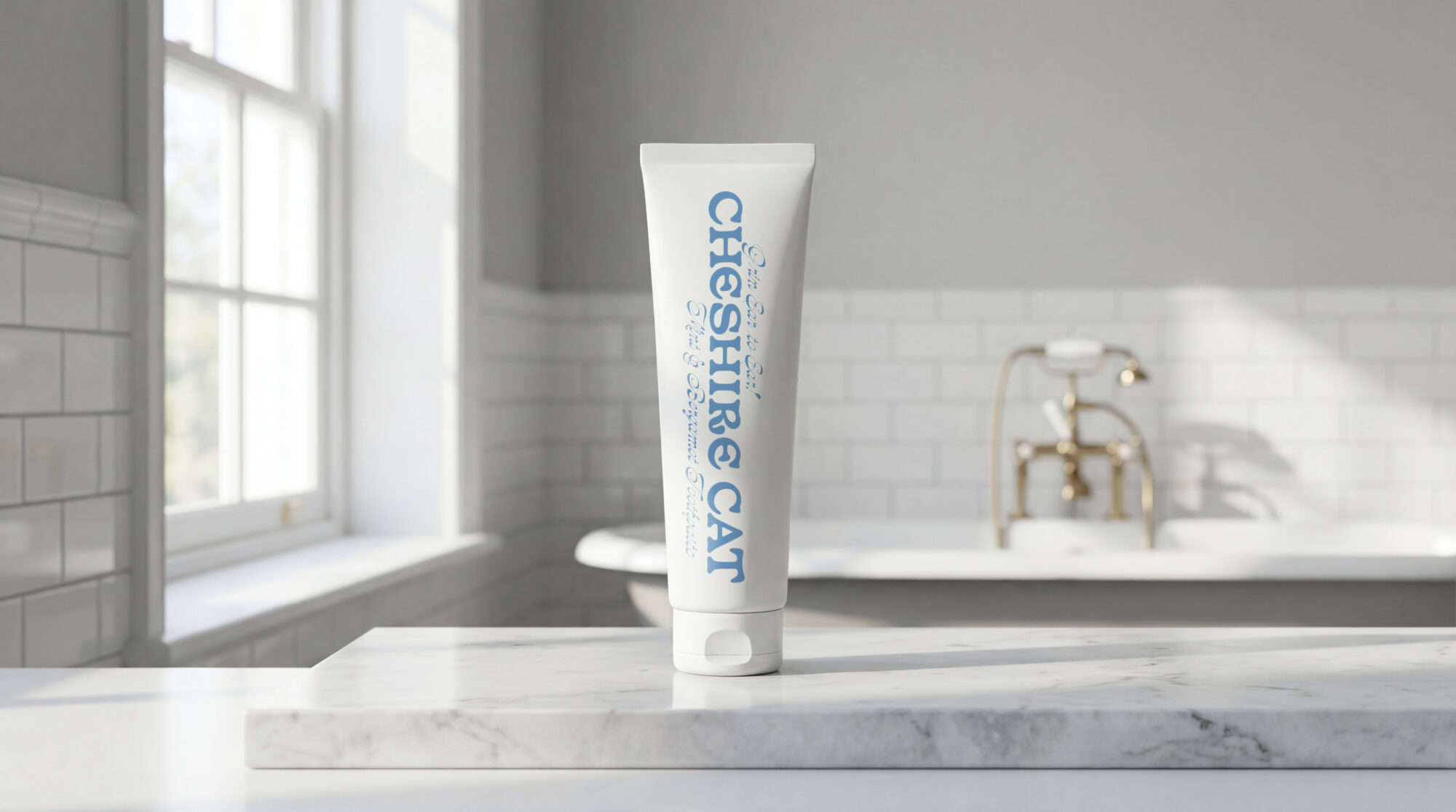
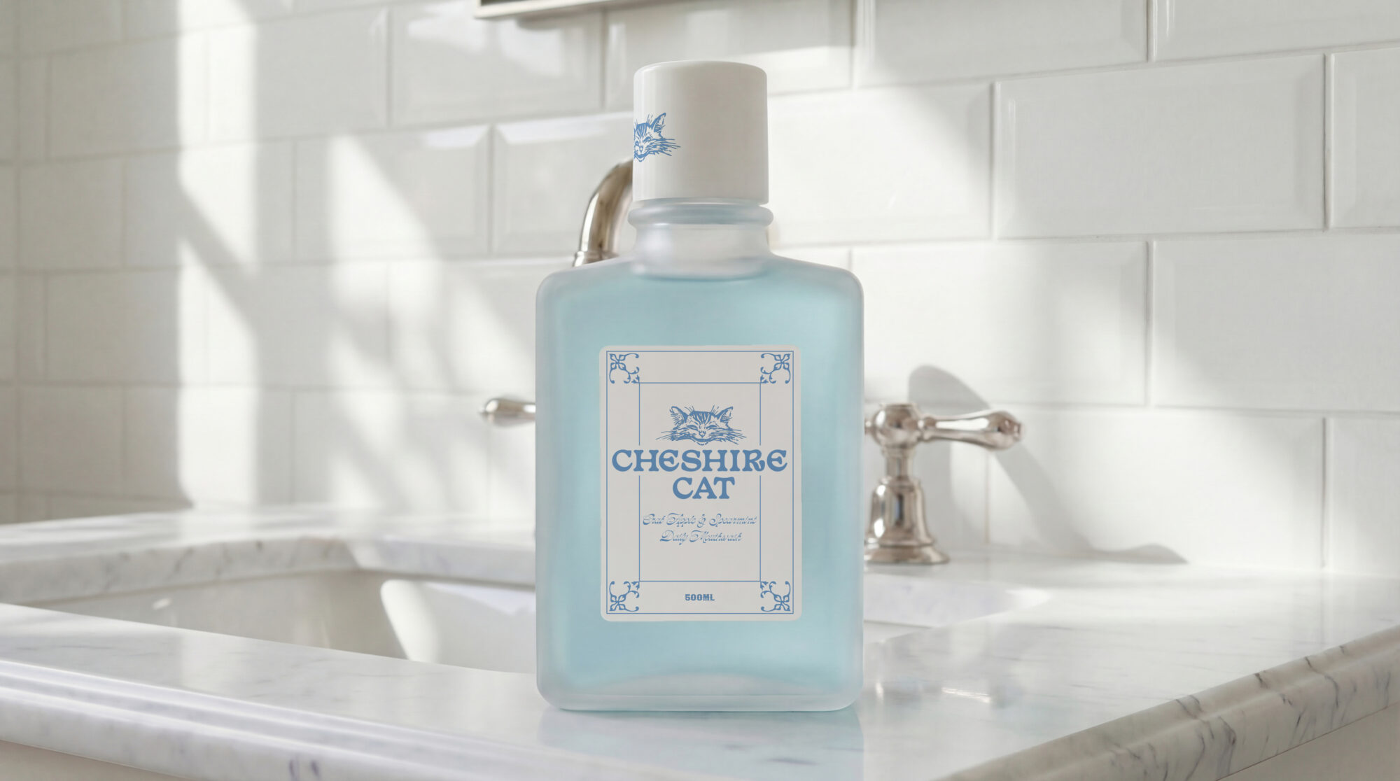
The playful insular Basteleur was used for the brand logo and Arthur Rackham’s 1907 Cheshire cat was digitised as a mascot. Oddity Script, a rare reverse-stress script font was used as a Victorian inflection.